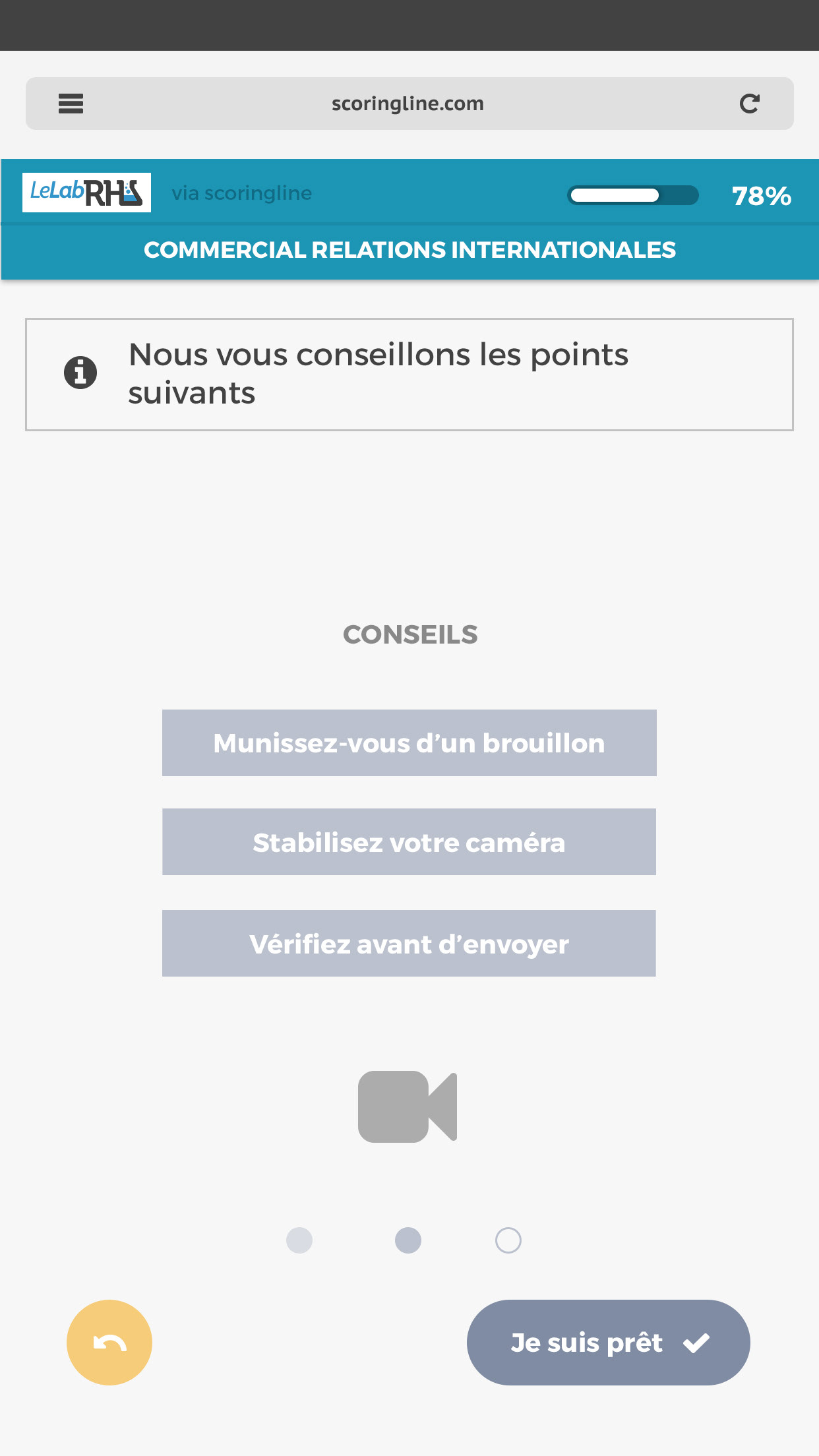
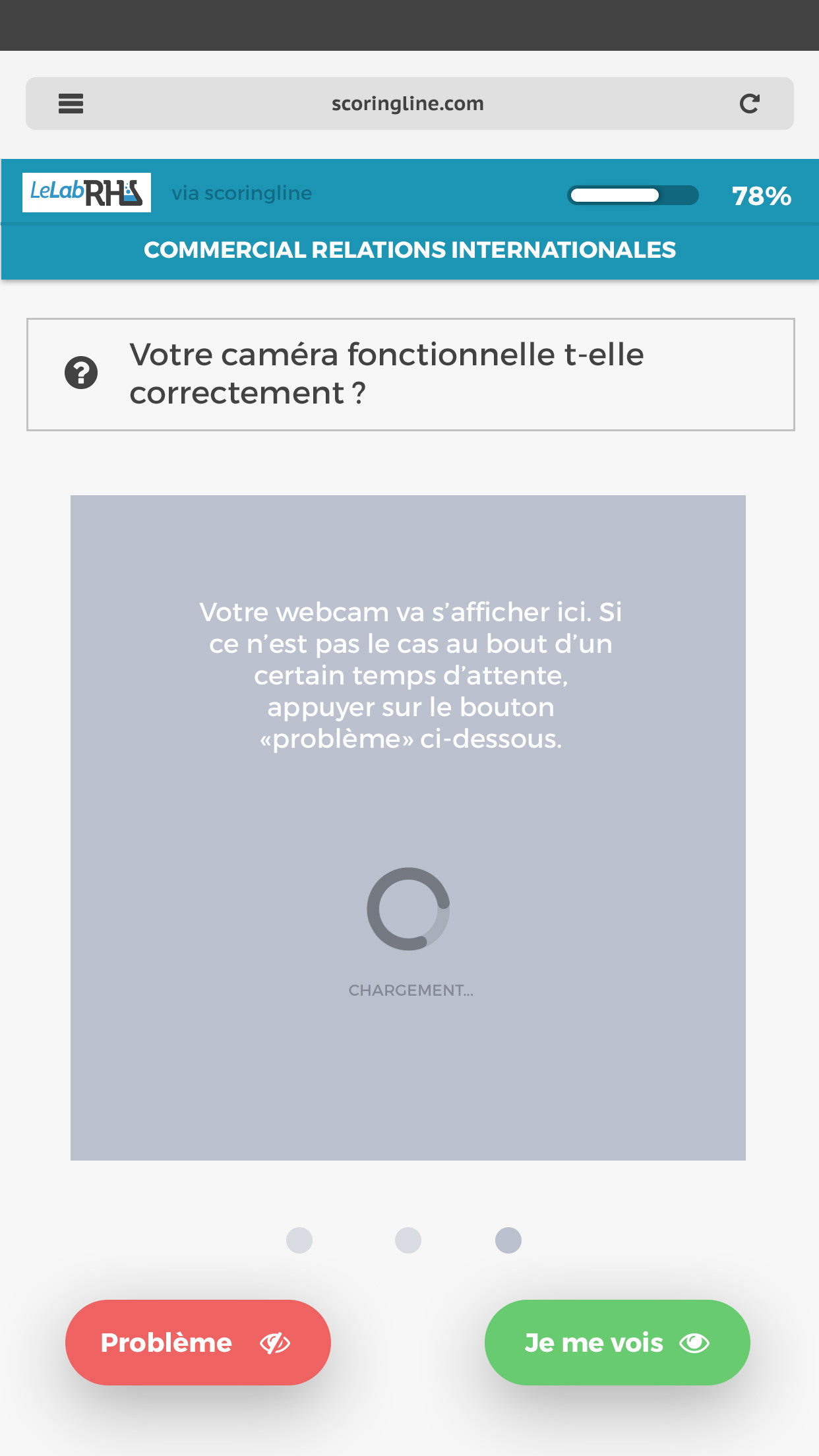
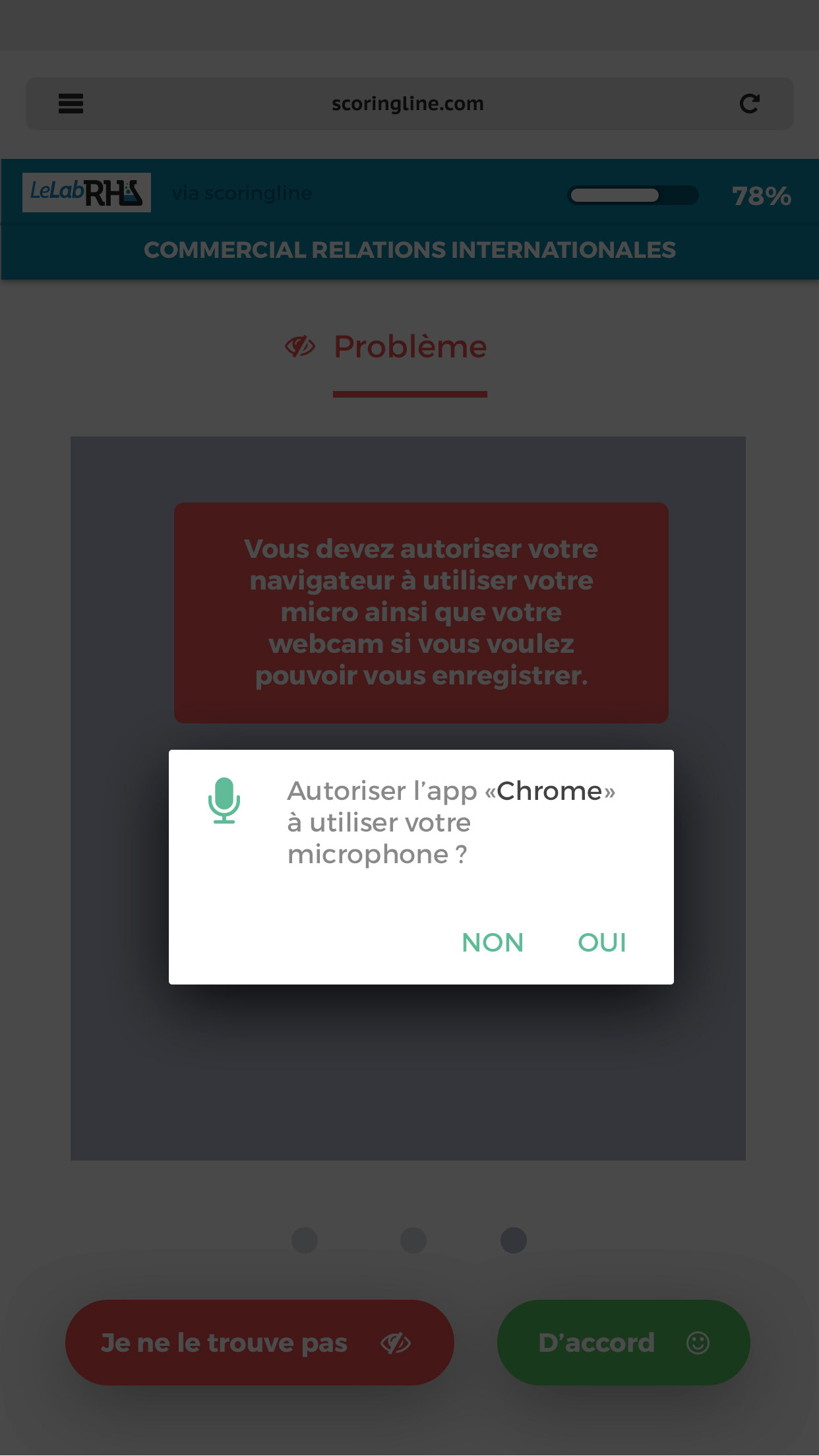
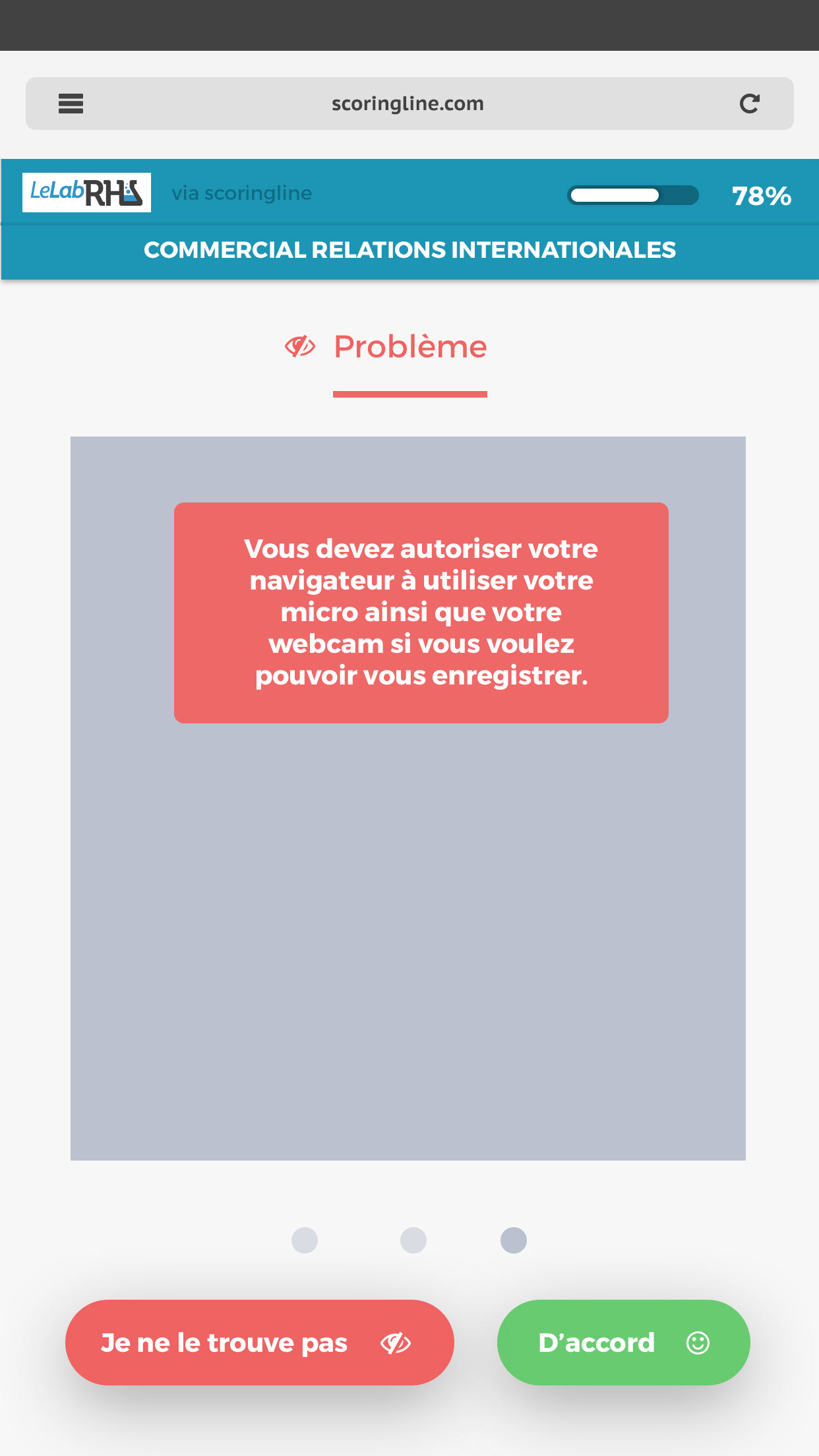
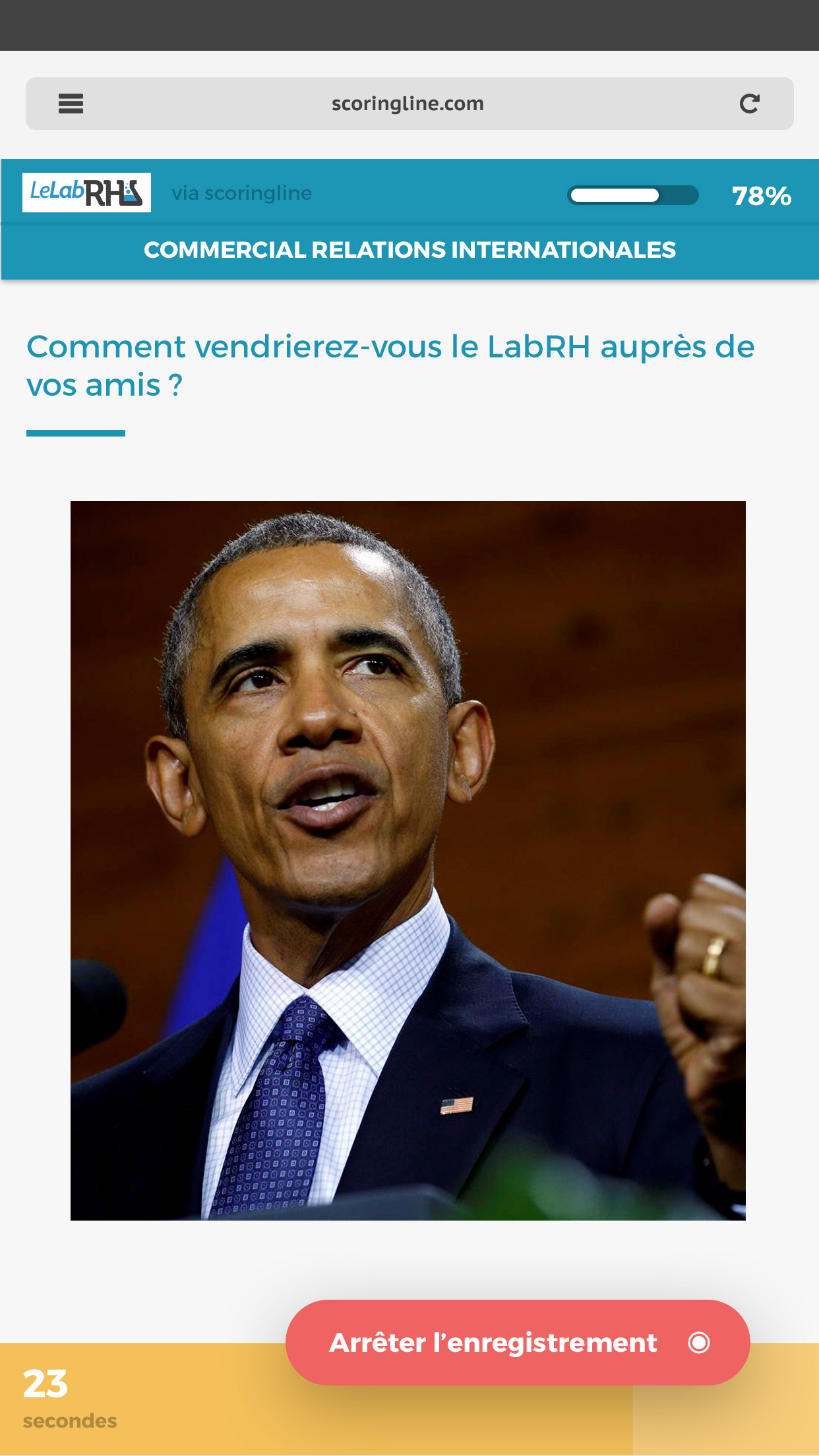
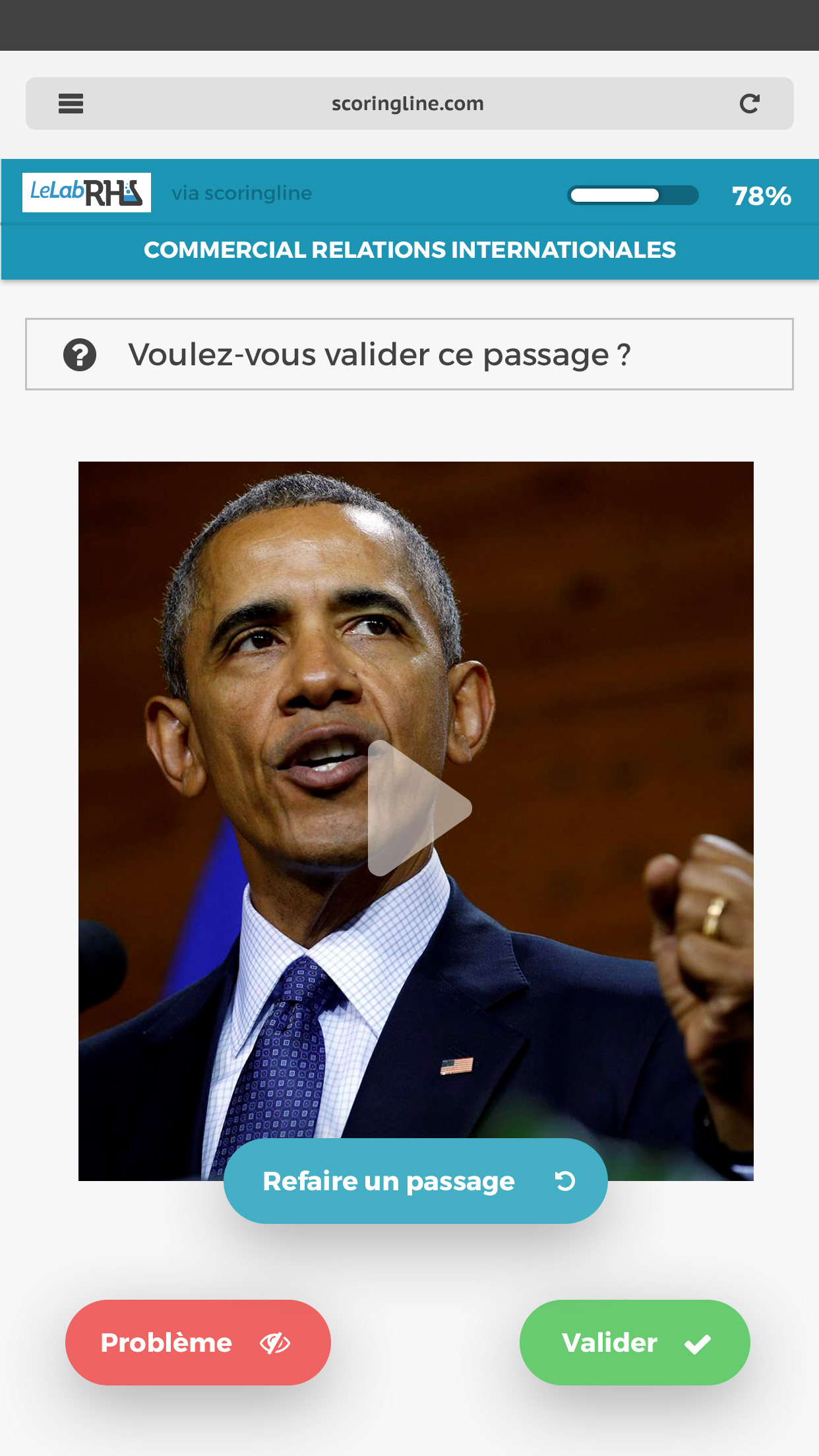
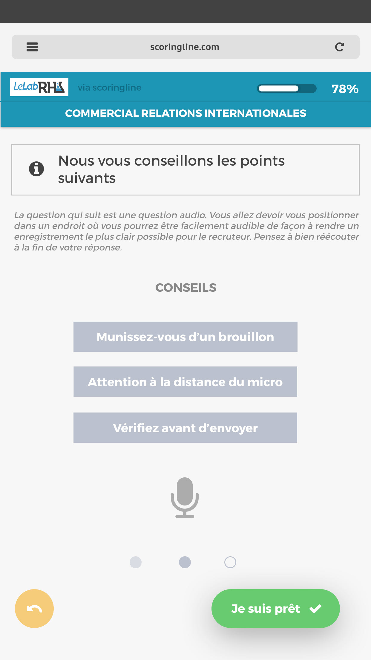
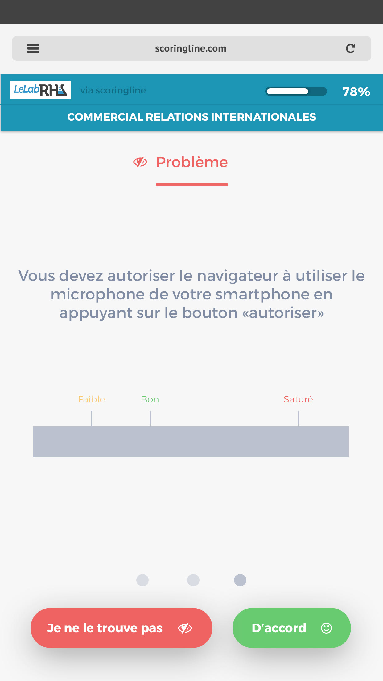
As the first designer of Scoringline, I had to build an UI system & graphic guidelines to improve the interface and the experience of the product. I also had to code & integrate my mockups to make it happen.
Scoringline is a recruitment company building a platform where companies can digitalize their own recruitment process and then get applications with highest score shortlisted, so they can make appointments with the best applicants, and not only the best CV.
The idea was to detect if people really match with the position they were applying for. So the platform allows companies to create questionnaires with role-play questions (text, audio and video questions). For instance:
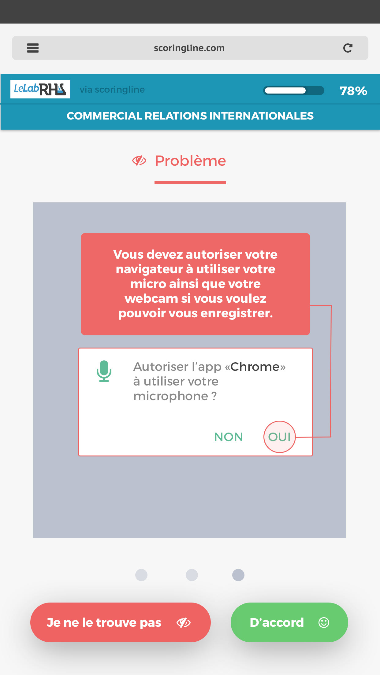
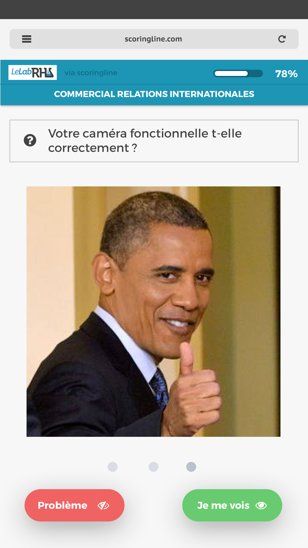
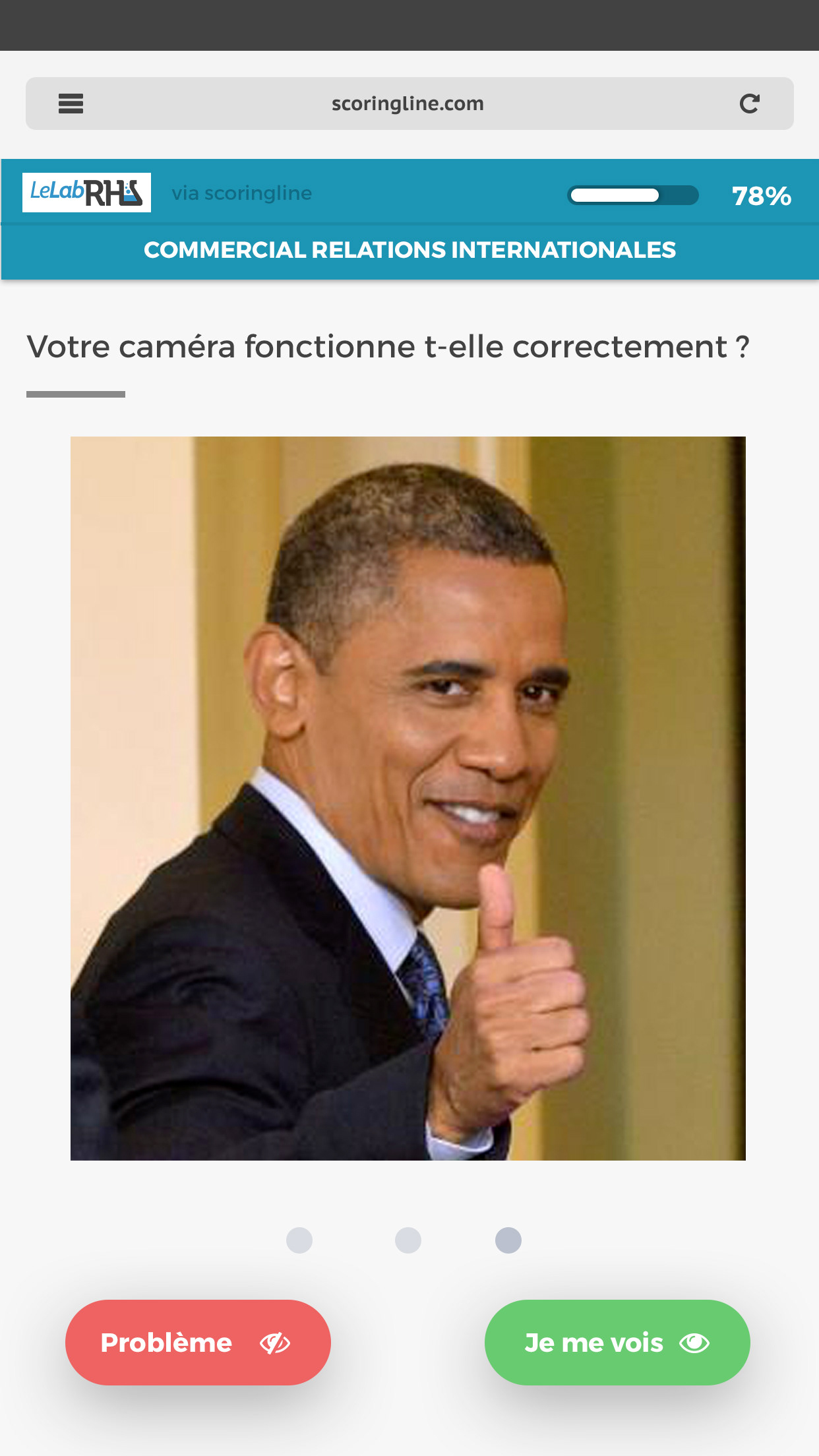
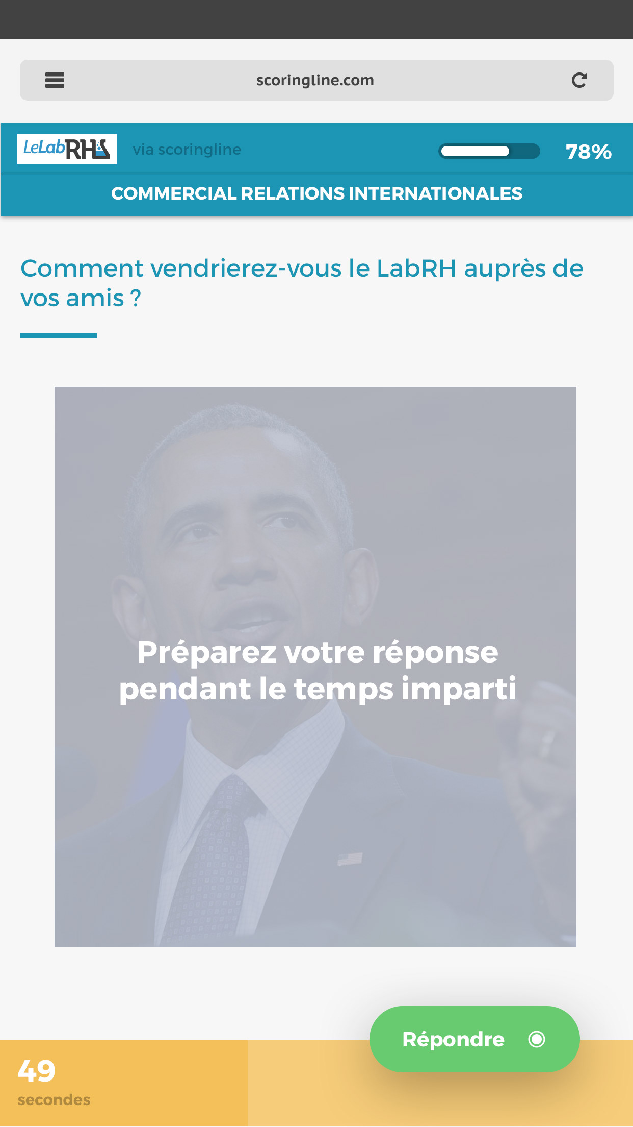
"How would you manage an angry client entering the store complaining about [...] ?" Answer with your webcam.
"How would you manage an angry client entering the store complaining about [...] ?" Answer with your webcam.
-
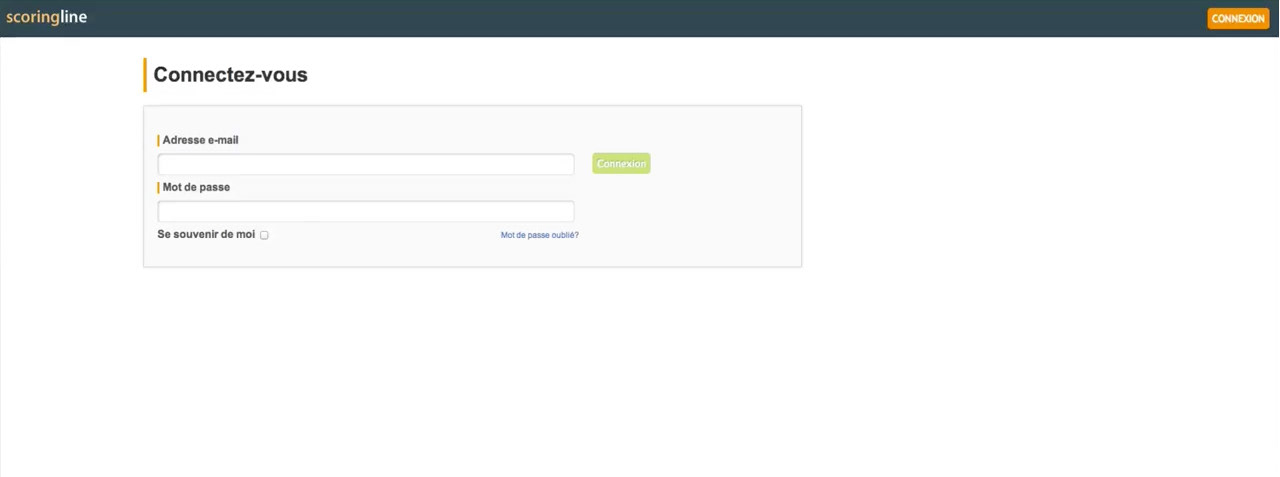
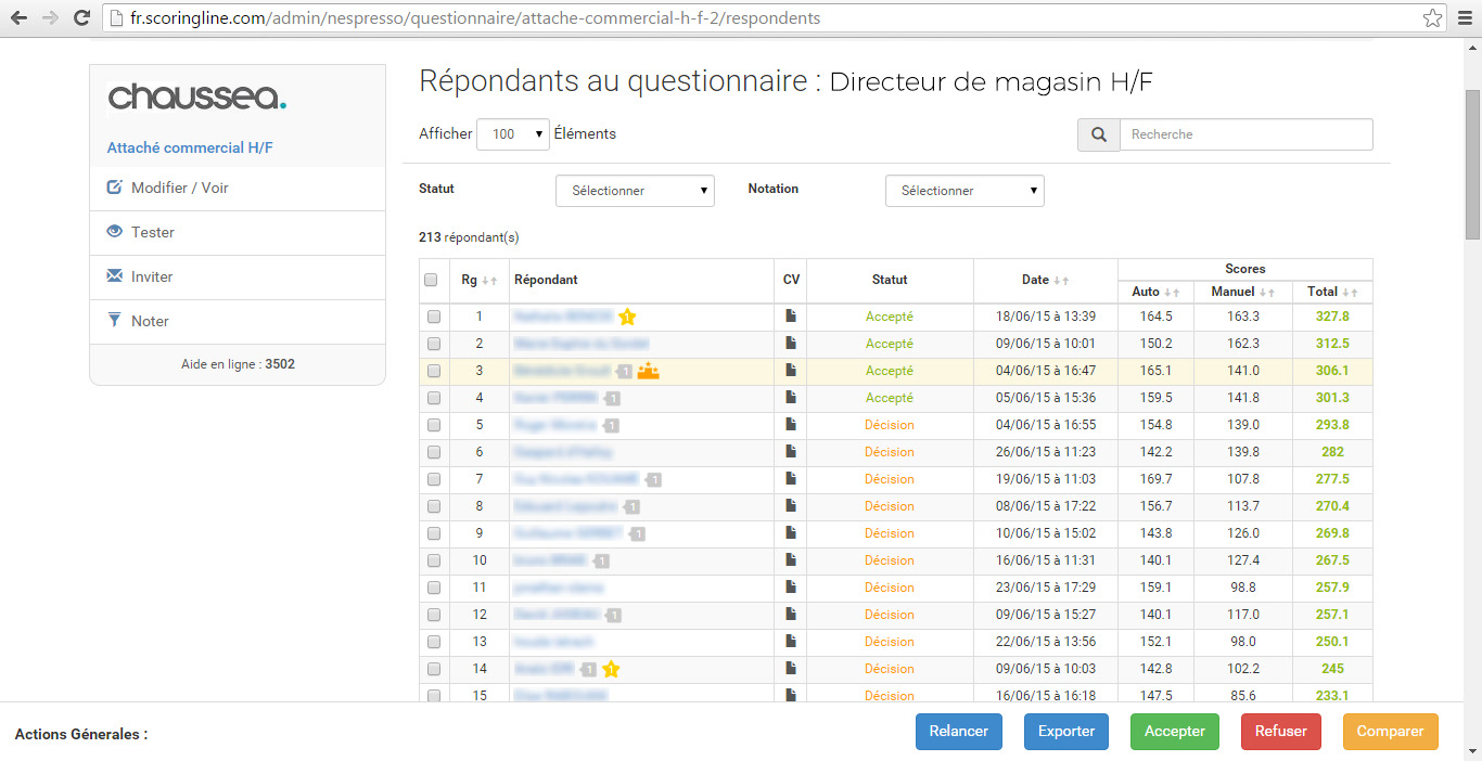
Before I've been recruited in this company, the product looked like that:



-
Discover what I made for Scoringline to solve their complexe challenges
-
You will see below two screens of the questionnaire creation process.
When I first came at Scoringline, creating a recruiting questionnaire was a huge and a very old style form to fill. I simplified it as much as I could, with progressive steps and a lot more interactions to lead the user to the end of the questionnaire creation by himself.
Before, it was a filling collaboration with Scoringline and the client. Nobody should be helped by someone to work on a product. A good UI does not need to be explained to you target and it's something Scoringline understood and that's why they give me so much confidence in this redesign.
-
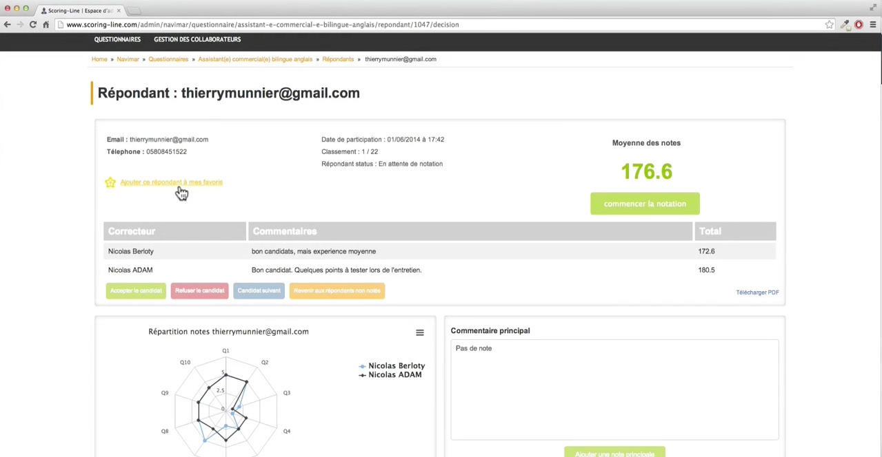
Applicants can now be more than their paper resume
I had a lot of visual informations helping recruiters to get a very fast summary about the applicant they are checking. I get inspired by video games to put some visual charts allowing an easy way to understand fastly what this applicant have more than others. Comparison will be easier too.
Also, now recruiters know what to do next with applicants depending on their status.
-
-
This screen below is about appointment session.
Recruiters can create appointments zones so applicants will be able to pick a meeting slot with recruiters.
-
-
We also made a video conference feature so recruiters and applicants could meet directly in the app.
-
-
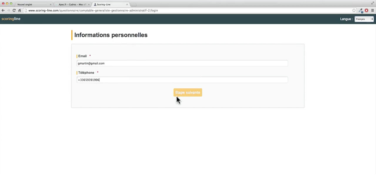
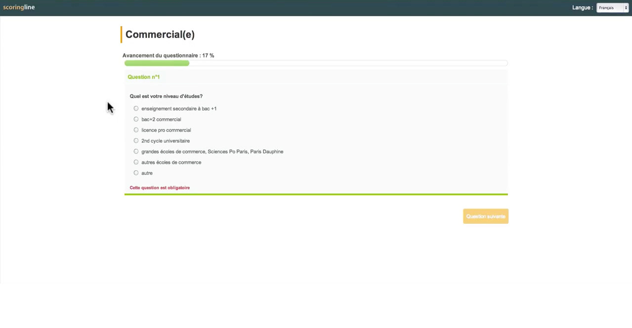
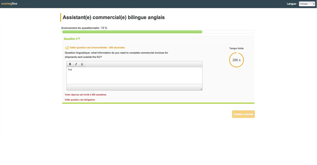
That was for the client side. Now let's see what we've done for applicants and how they are welcome.
-
BEFORE:
-
BEFORE:
-
-
After
-
I have added some humanity to the questionnaire with someone who is welcoming us as it would be done in real life interview.
You can choose the default introduction which is the same for every compagnies, or you can customize it with your own photo and welcoming messages:
-
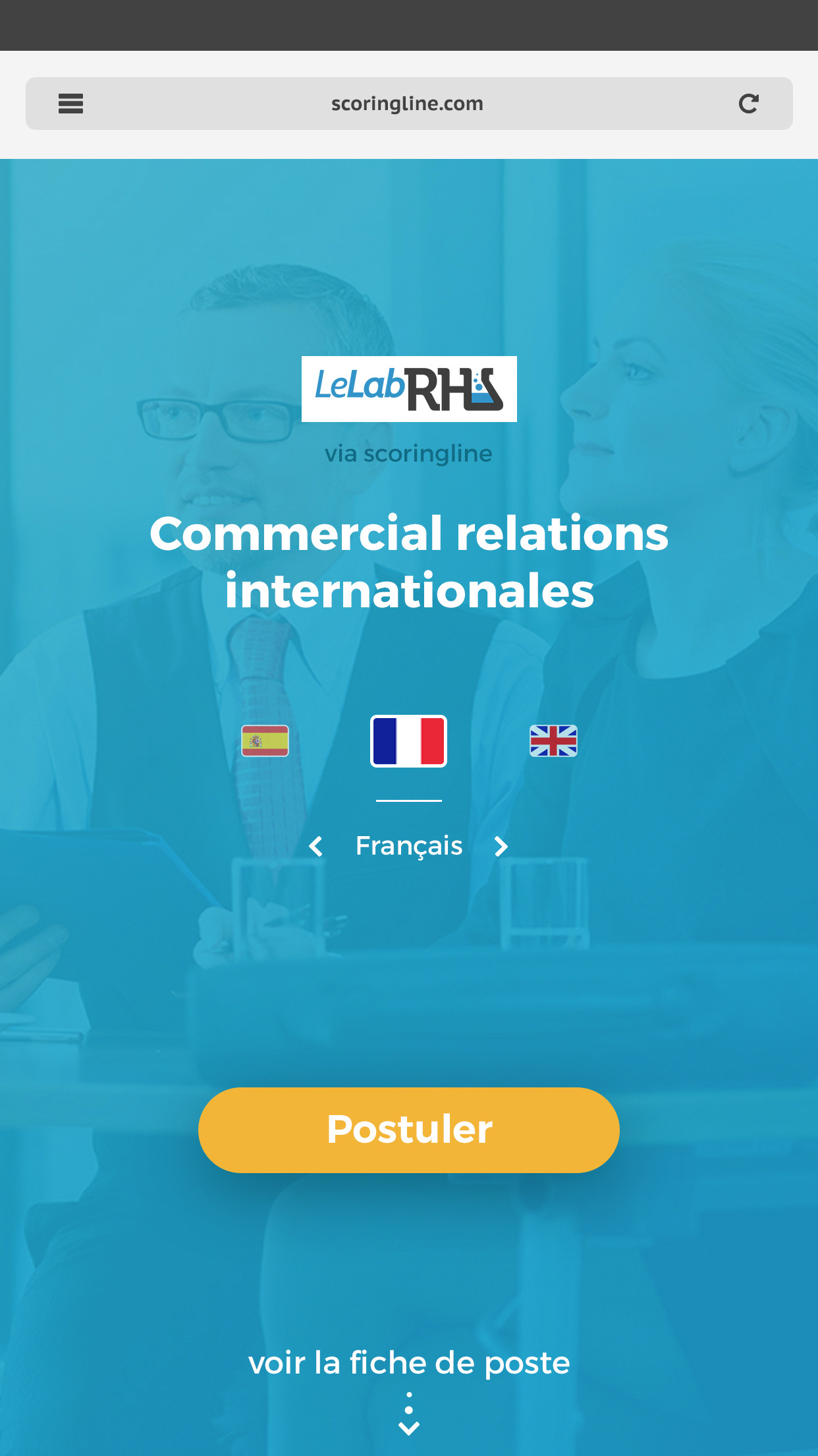
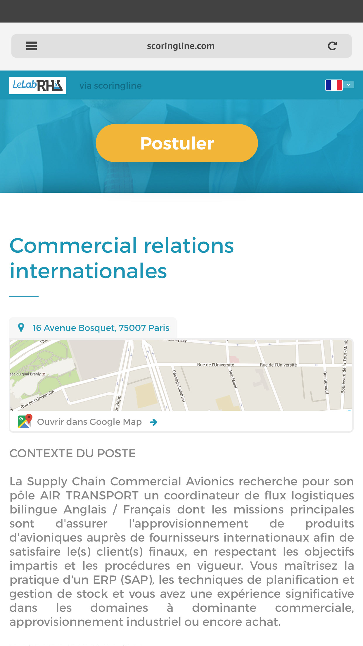
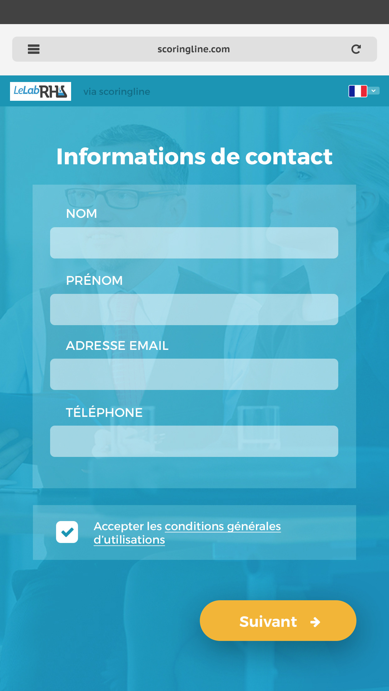
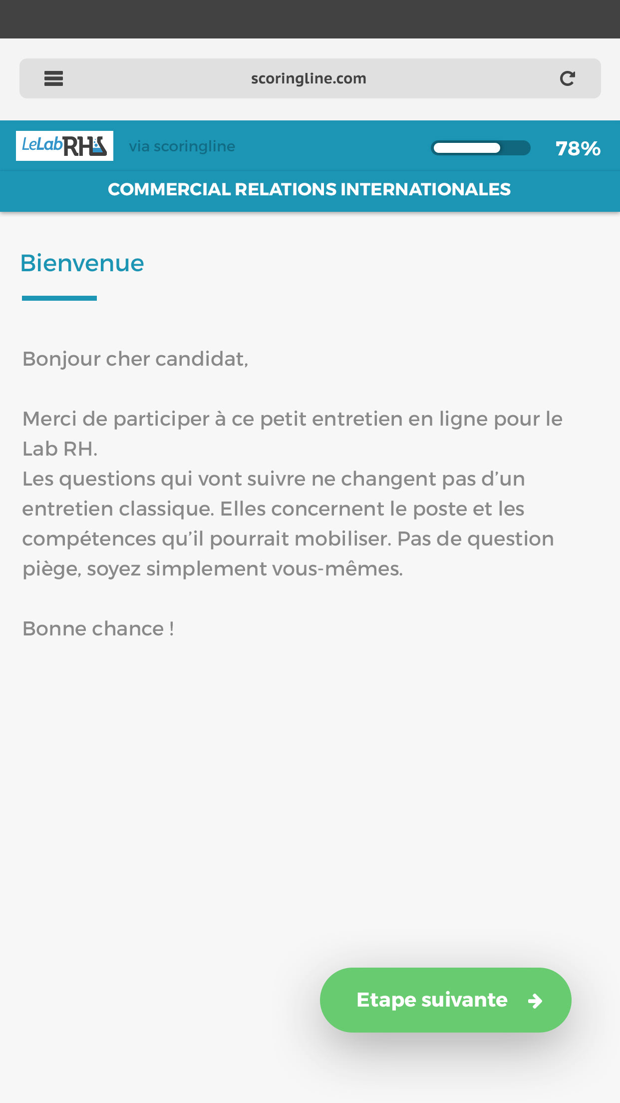
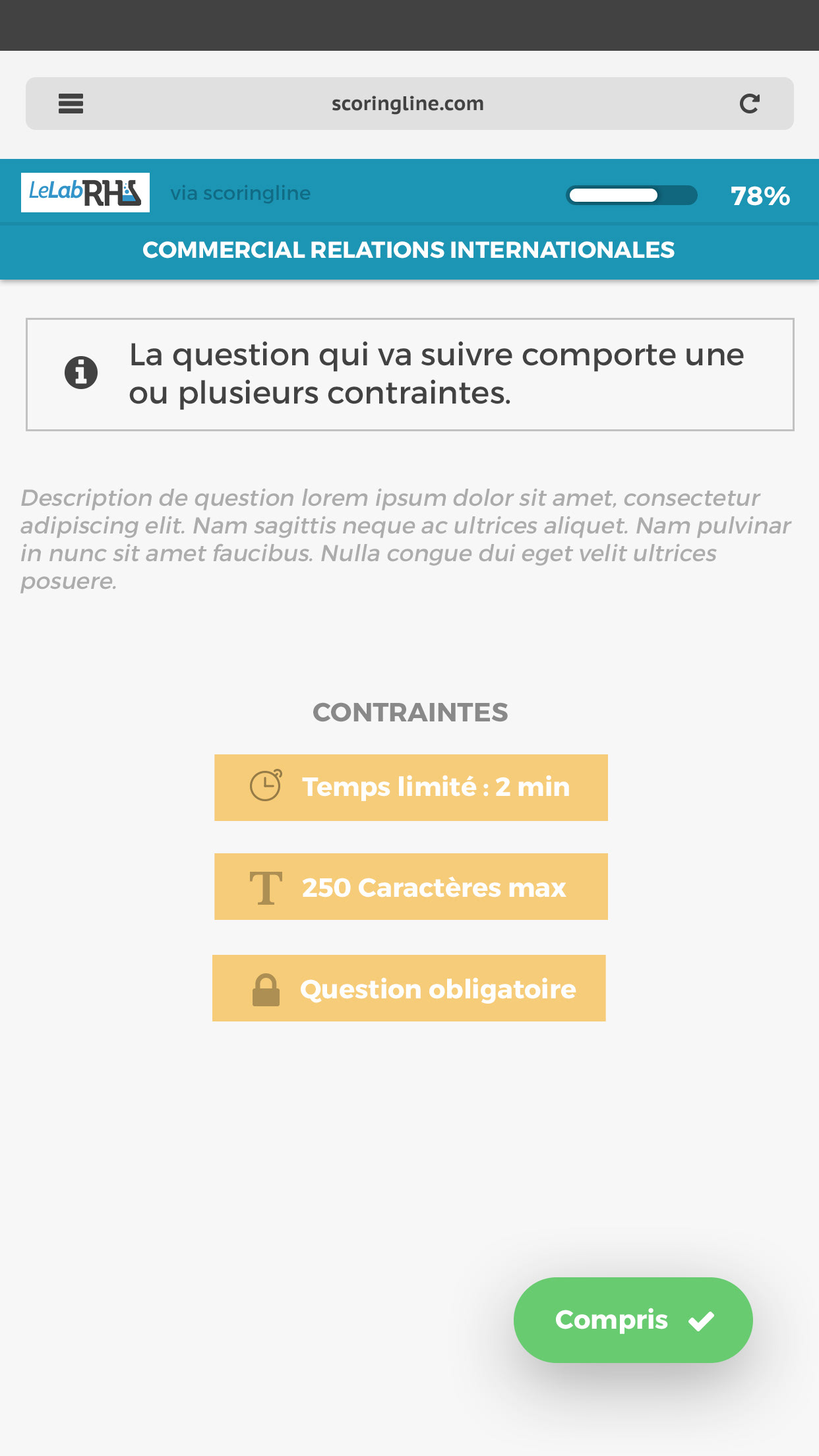
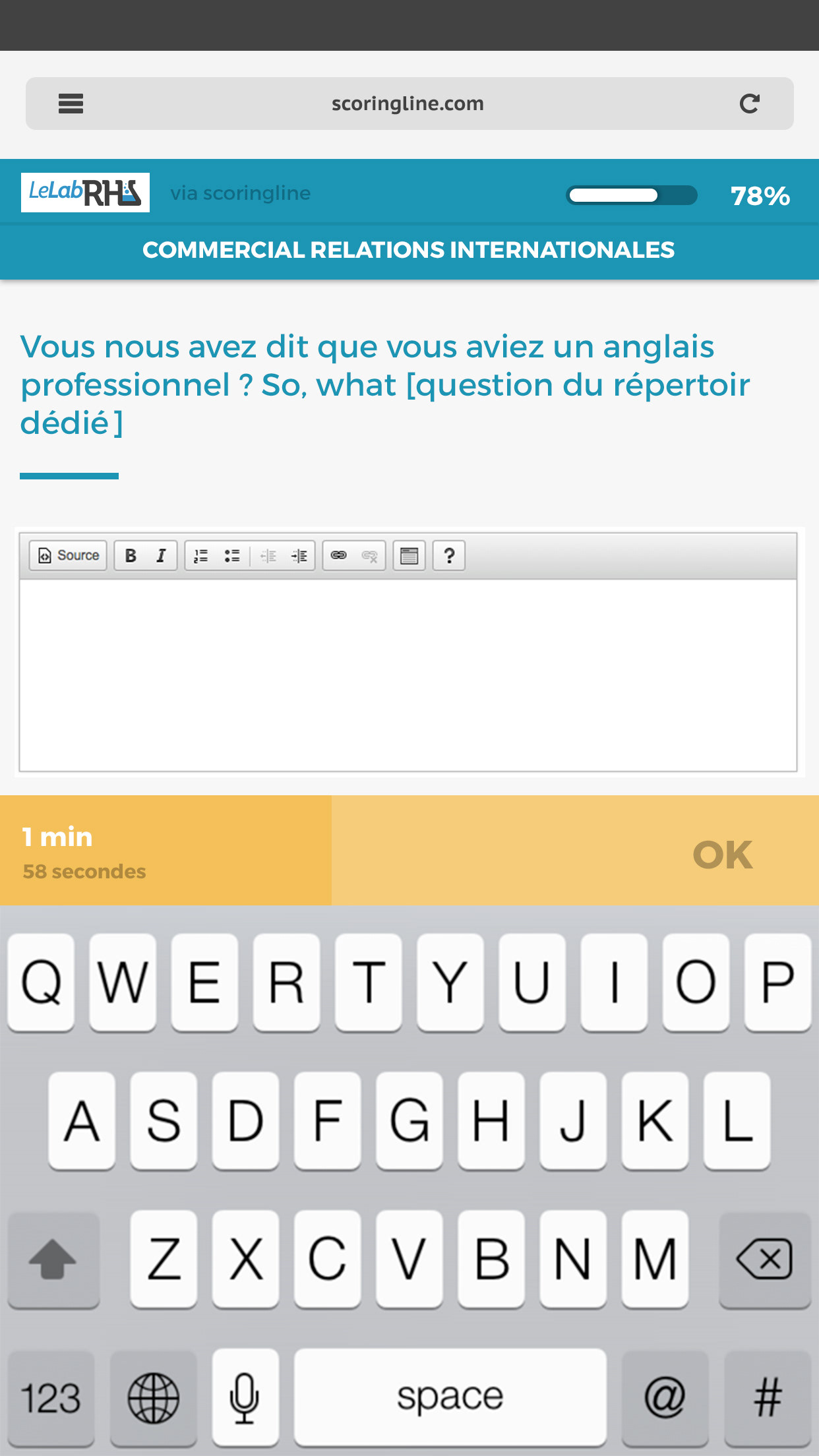
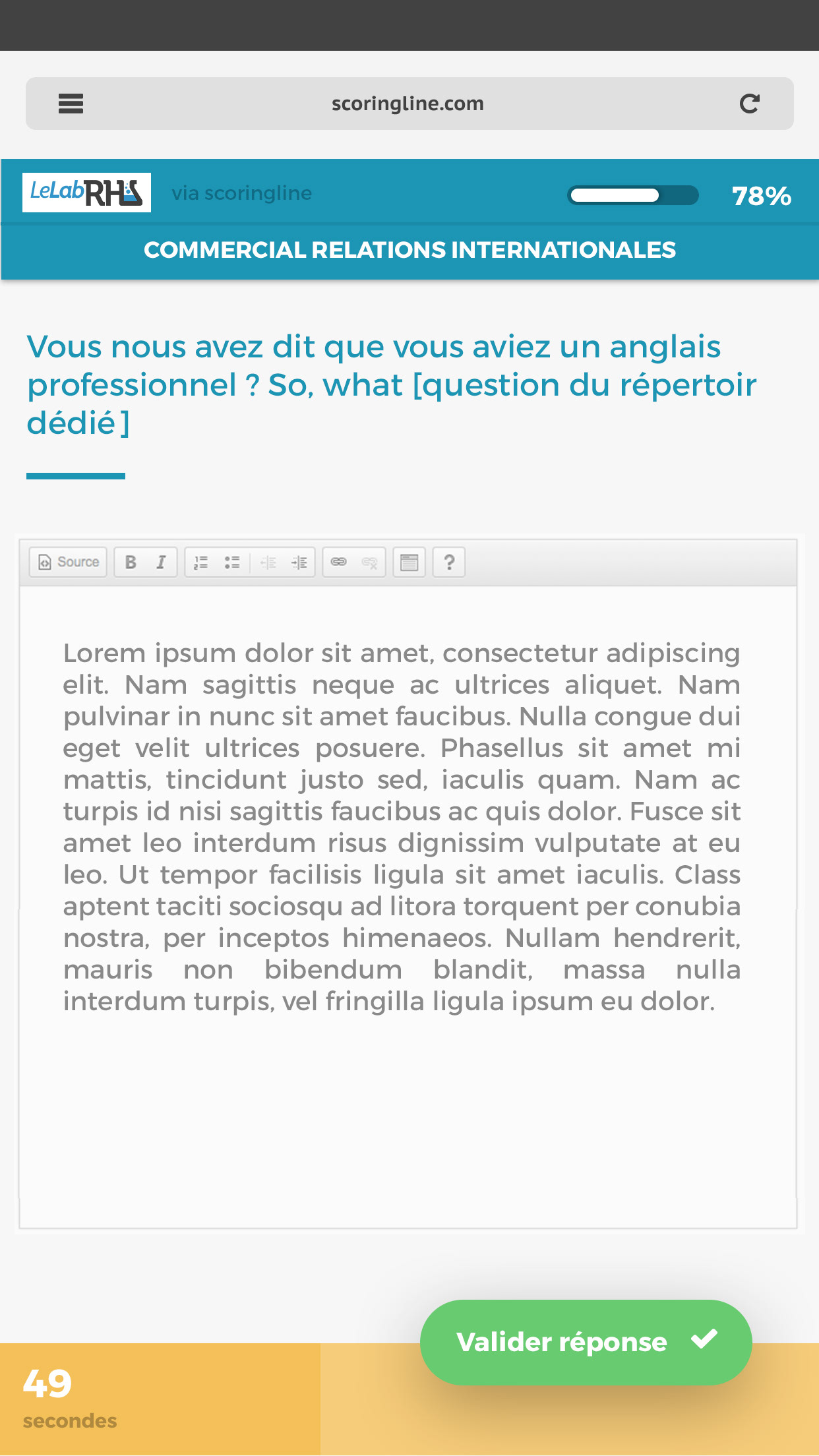
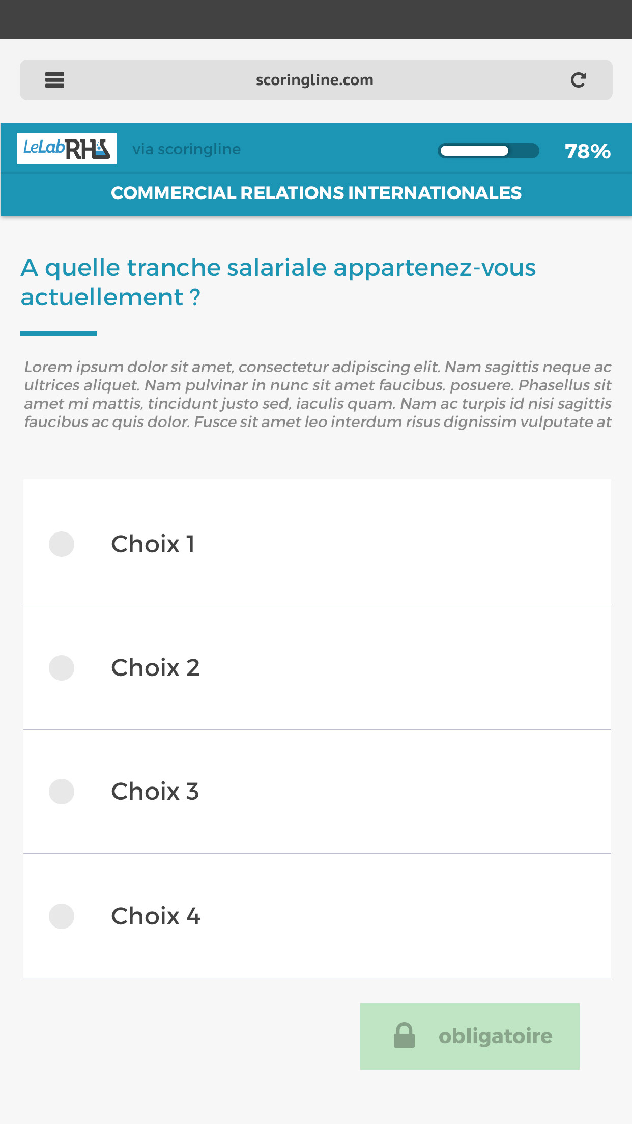
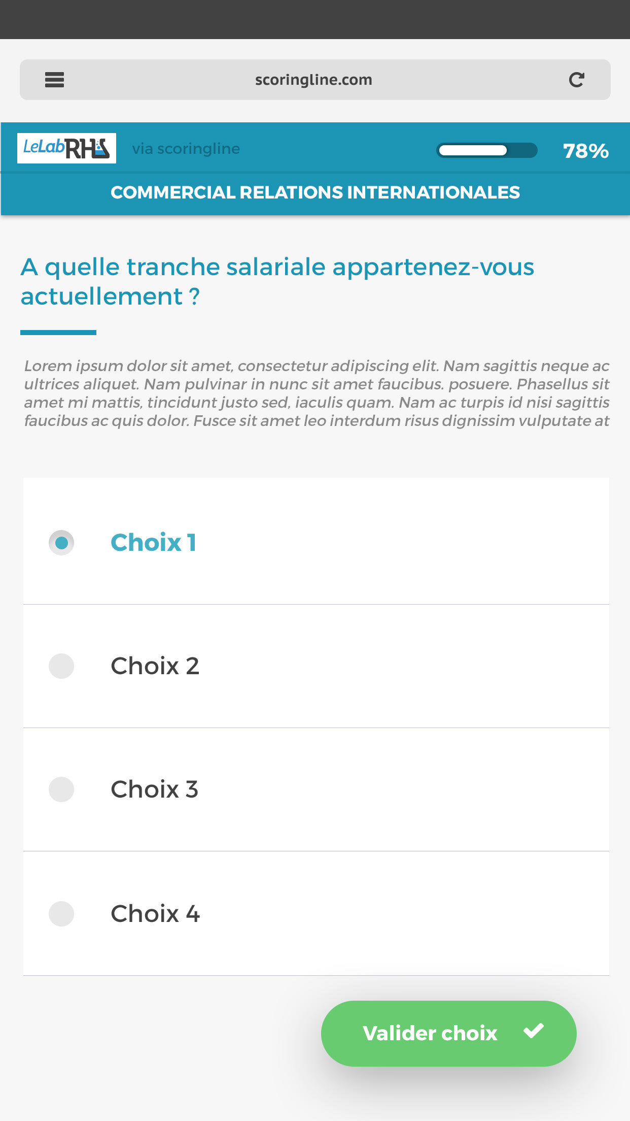
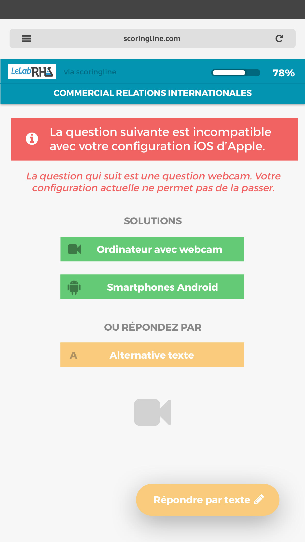
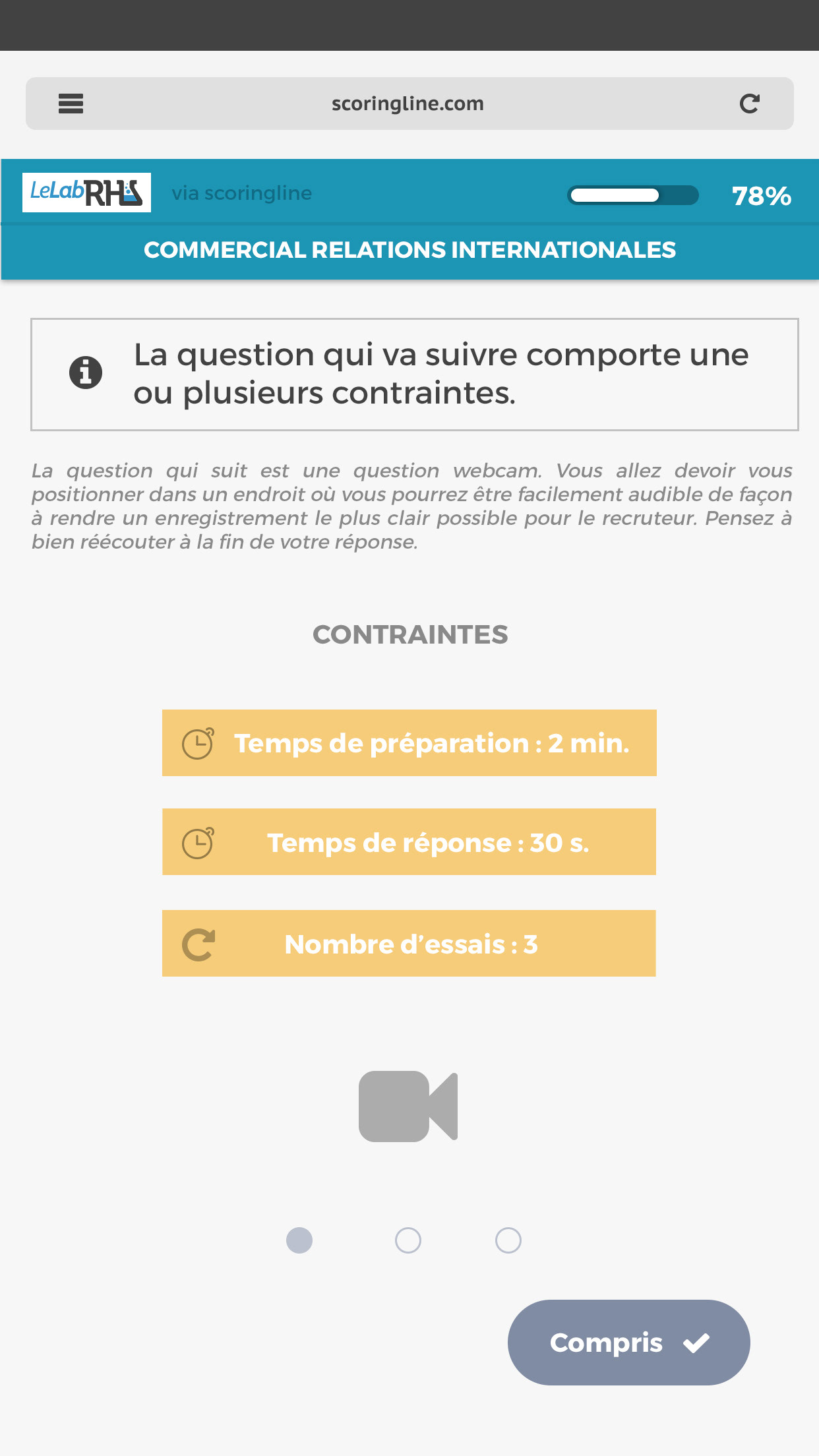
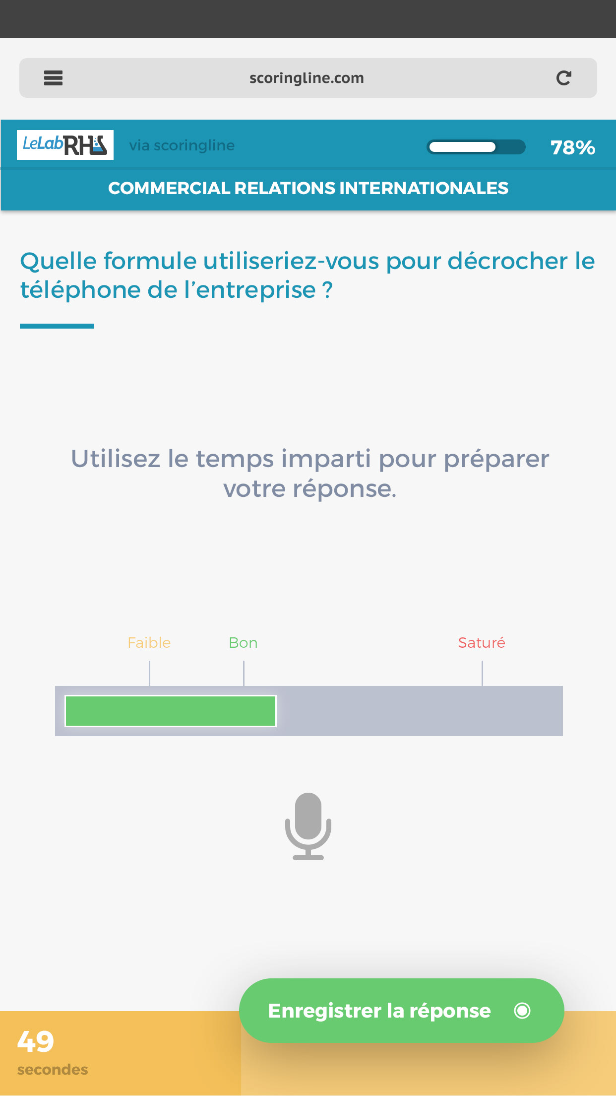
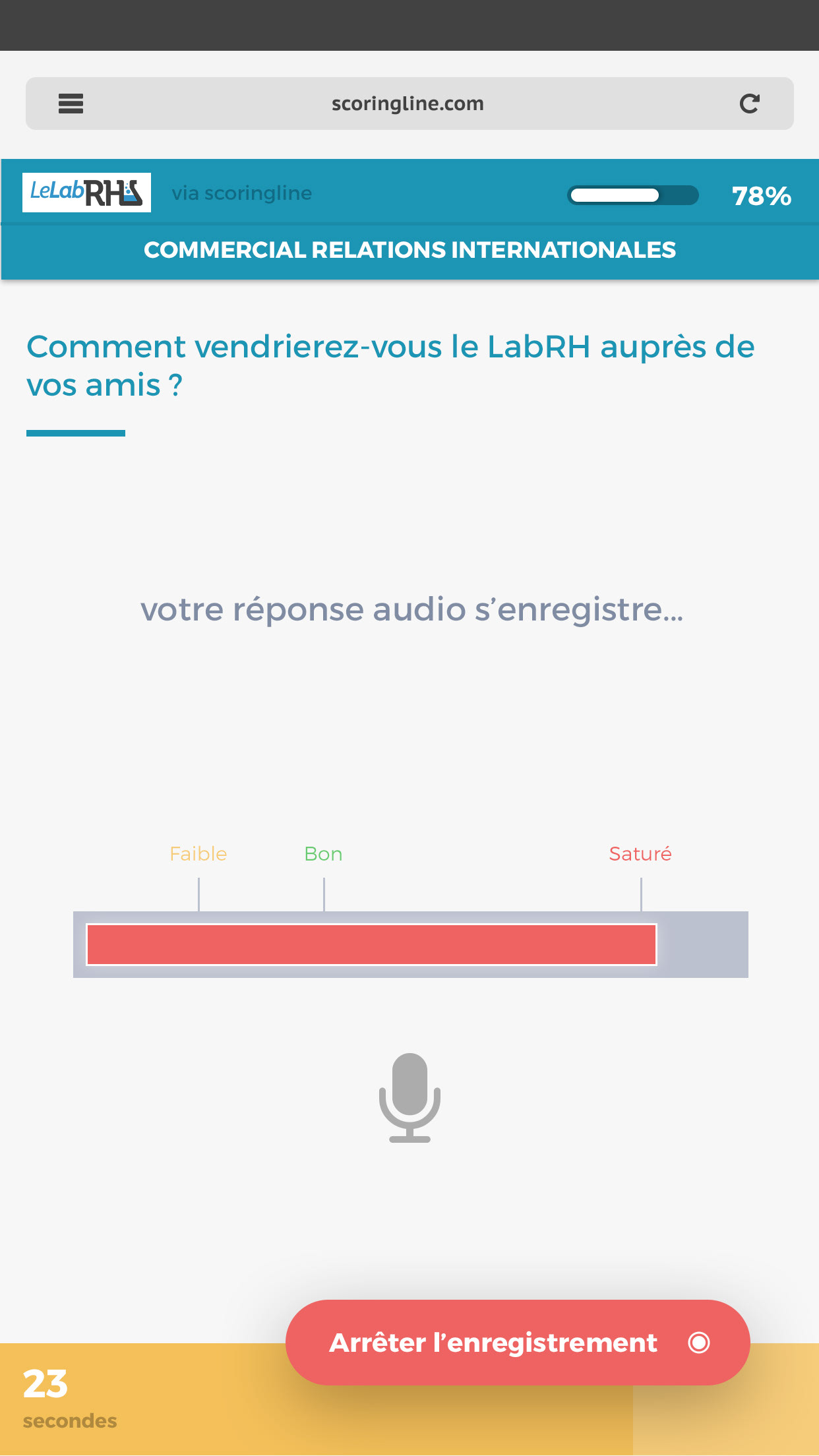
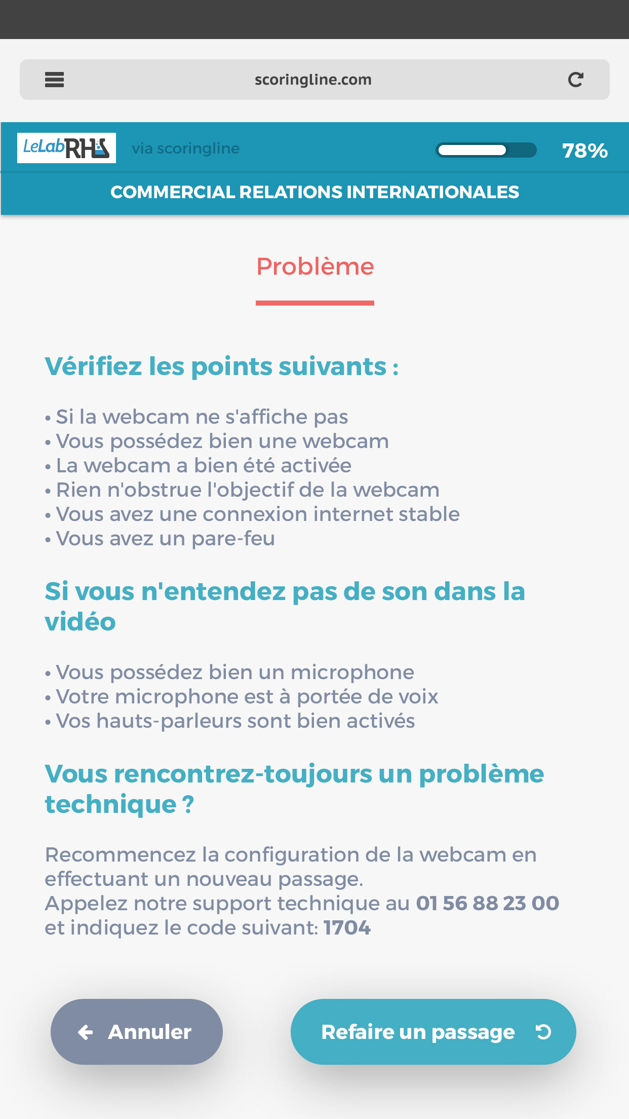
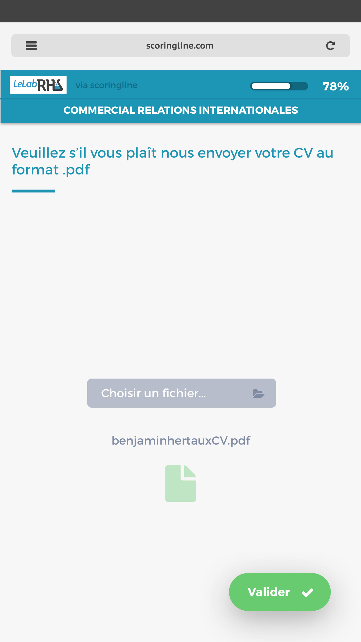
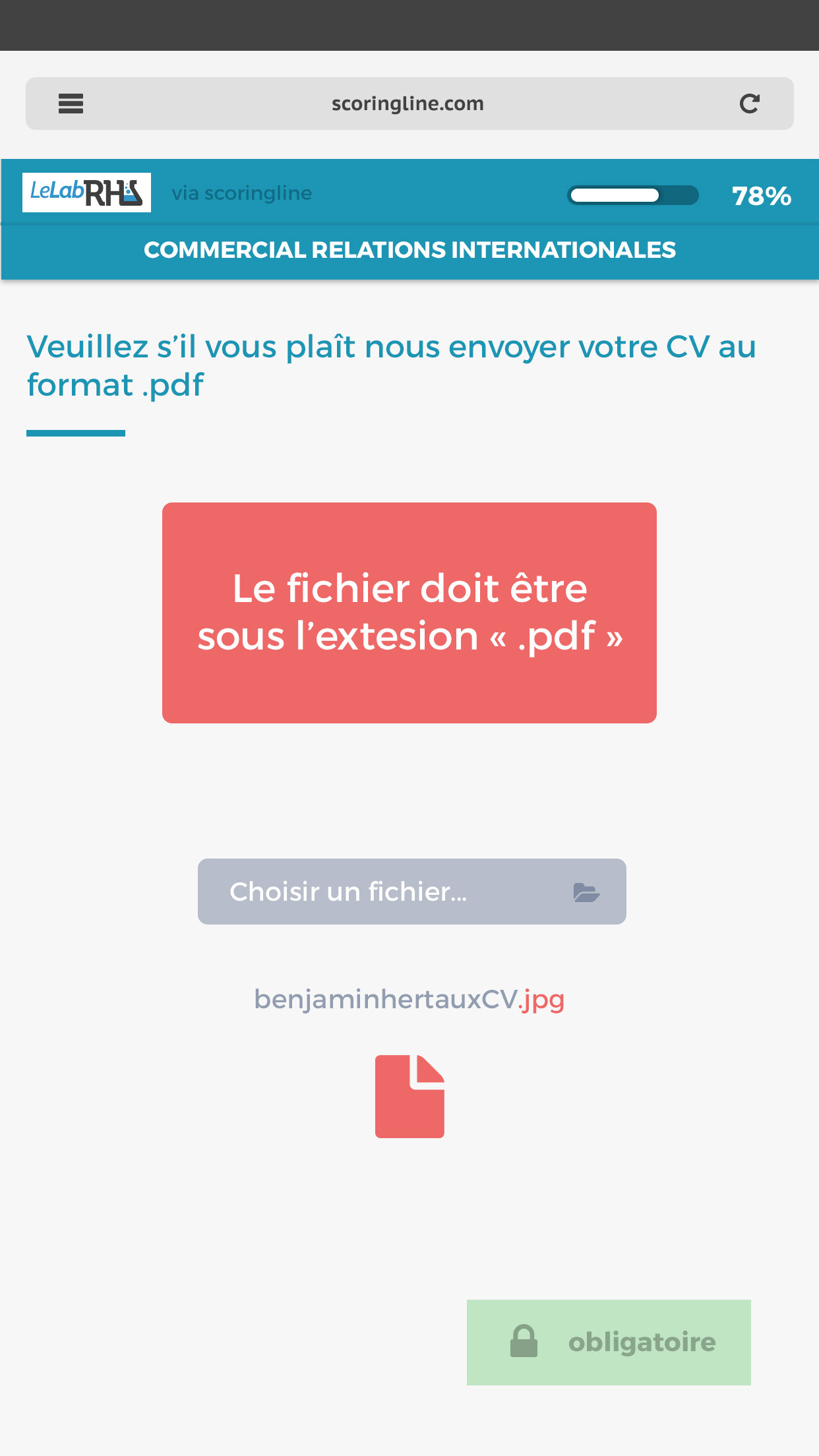
And I also made it available on mobile phone for the applicants
